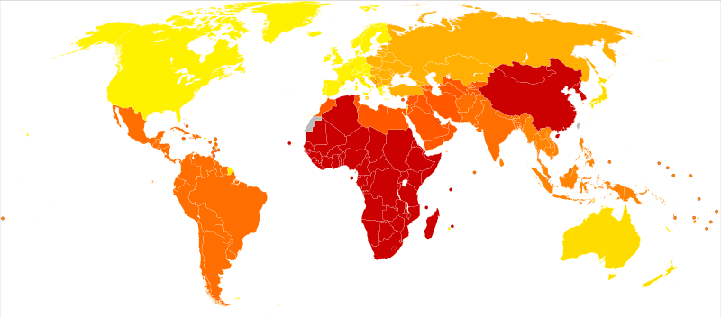
map of the world shows areas of bi-polar prevalence
3 Responses
This map shows bipolar DALYs, not prevalence. It’s likely that the areas with deeper colors simply have worse medical care for mental illness. This would explain why the U.S. is a bright shade of yellow even while it has a high prevalence of the disease (~4%) and a racially diverse population.
This map is of disability-adjusted life years, not prevalence. The countries with darker colors tend strongly to be ones with worse medical care, presumably for mental illnesses.
This map, coupled with the word “prevalence,” seems to imply that people of African and East Asian descent have the highest rates, but the statistics show roughly equal rates among all races. If prevalence by race was really divided this way, the U.S. would be an orange color due to its diverse population, and Japan would be as crimson as its (poorer) western neighbors.
I finally received your two messages… some problems with my server apparently. I apologize for the delay and do sincerely appreciate your feedback. I will look over the map again keeping in mind your comments. Thank you for your persistence. Best Regards, Helen
This map shows bipolar DALYs, not prevalence. It’s likely that the areas with deeper colors simply have worse medical care for mental illness. This would explain why the U.S. is a bright shade of yellow even while it has a high prevalence of the disease (~4%) and a racially diverse population.
See the discrepancies between http://en.wikipedia.org/wiki/File:Diabetes_world_map_-_2000.svg
and
http://en.wikipedia.org/wiki/File:Diabetes_mellitus_world_map_-_DALY_-_WHO2004.svg
This map is of disability-adjusted life years, not prevalence. The countries with darker colors tend strongly to be ones with worse medical care, presumably for mental illnesses.
This map, coupled with the word “prevalence,” seems to imply that people of African and East Asian descent have the highest rates, but the statistics show roughly equal rates among all races. If prevalence by race was really divided this way, the U.S. would be an orange color due to its diverse population, and Japan would be as crimson as its (poorer) western neighbors.
Hi John,
I finally received your two messages… some problems with my server apparently. I apologize for the delay and do sincerely appreciate your feedback. I will look over the map again keeping in mind your comments. Thank you for your persistence.
Best Regards,
Helen